Have you ever opened someone else’s stylesheet?
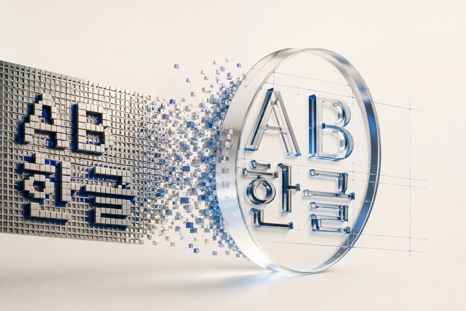
I liked the Latin typeface on a website. The letters were carved from pixels: no curves, strokes set firmly on a grid, as though just lifted from an old game-console screen.
I wanted to use it.
So I looked inside that house.
78 and 4
The font settings were tidy.
Body      Pretendard Variable
Heading   Pixelify Sans
Fallback  "Courier New", monospace
Hangul used a Korean font, and Latin headings used pixels. They were separated.
But as I counted the elements using the pixel font, my hand stopped.
78 elements.
Of those, 4 contained Hangul.
Those four did not know what faces they were showing.
Characters It Cannot Make
A pixel font’s lack of Hangul is not laziness.
The Latin alphabet has twenty-six letters. Even adding uppercase, lowercase, numbers and symbols, the count stays below a hundred. Place them one by one on a grid and the job is done.
Hangul exceeds ten thousand characters as initial consonants, medial vowels and final consonants push and pull at one another. A final consonant compresses the upper part; without one, the character stretches downward. The same ㄱ sits at a different size in each position.
Fitting all of that onto a 7×9 grid is not the same kind of task as fitting twenty-six letters.
That is why most Latin display fonts have no Hangul.
The problem is what happens when it is absent.
A missing file produces a 404. Incorrect code stops the build. When something goes wrong, the screen tells you.
Glyphs are different.
The browser searches for the character in the specified font. If it is absent, the browser silently moves to the next font, and then the next if necessary. Eventually it finds the character somewhere and draws it.
No warning. No log. Just a different face.
The site’s four headings were assigned the pixel font. Assigned, but not drawn in pixels. The Latin headings beside them sat on the grid, while those four alone would have appeared in the system’s Korean sans-serif.
On one screen, headings have two faces.
The creator probably did not know. Neither did I, until I counted.
What Works Now and What Will Keep Working
When bringing that font into my site, I first wrote one sentence.
Do not use it anywhere Hangul might appear.
Once written, it produced one judgment after another.
A phrase such as Notes from the work is safe. It is Latin text I hardcoded myself, and it will still be Latin tomorrow.
The problem was values coming from data.
I was about to make the subtitles in the ideas list pixelated, but stopped. All five are in English now. Someday, however, I will write one subtitle in Korean. On that day, only that line will have a different face, and I may not notice for months.
What works now is different from what will keep working.
I excluded every place populated by a variable.
A Twelve-Pixel Grid
The reference site was using the font even below 12px, with opacity reduced to 35%.
A pixel font is built on a grid. If a character is drawn on 7×9 cells, it is cleanest when enlarged by multiples of that grid, because the grid aligns exactly with screen pixels.
12px is not such a multiple.
Strokes straddle half-pixels. The browser fills those overlaps with gray blur. Corners that should be sharp become mushy; lower the opacity as well, and you are guessing rather than reading.
My site had uppercase labels in 138 places.
FOCUS SERVICES CURRENTLY FOCUSED ON
All were 10–12px: the most numerous and most visible positions. Putting the font there would have spread a pixel rhythm across the whole site.
I used it in none of them.
Instead, I left this in a class comment.
/* The fixed pixel grid blurs strokes at small sizes.
   Do not use below 13px. No Hangul glyphs — English only. */
So that, months later, I would not face the same temptation again.
At Sixty-Eight Pixels
The grid that undermines small letters works in the opposite way when enlarged.
At 68px, no half-pixel slips out of place. Corners stand sharp as knives. It produces a kind of decisiveness that the delicate curves of a serif cannot.
The first sentence on my home page is this:
Reduce the noise. Build what truly matters.
It is an invitation to strip away the unnecessary.
I ended up saying it in letters whose strokes had been reduced to the simplest grid. I had not planned that, but it fit.
The same typeface is a flaw at 12px and a statement at 68px.
What Cannot Be Tilted
The third obstacle appeared somewhere unexpected.
My large headings had used italics to pause and breathe.
The work speaks
before the words do.     ← Italic
Serif italics are not merely slanted letters. Stroke connections change, and the trace of the brush comes alive. They read less like emphasis than like a voice lowering.
Pixels have no italics.
Ask for what does not exist and the browser makes it by skewing the whole letter. The grid leans diagonally, and steps appear along the edges of strokes that should be smooth.
I abandoned the slant. I used color instead.
The work speaks
before the words do.     ← Blue
Then I applied this consistently across the entire site: the hero, section headings and subtitles.
Visitors could now read the rule. When blue rests on pixels, that line is important.
Losing one thing created a system.
Choosing Where to Fall
The last thing I changed was the fallback.
On the reference site, failure of the pixel font led to Courier New: typewriter lettering.
During the few seconds a font file arrives late, visitors see a typewriter instead of pixels. Different widths shift line breaks, making the impression that of an entirely different site.
A fallback is not a place where anything will do. It is where we ask, Does this still look like the same house?
I changed it to a monospaced sans-serif family.
Leaving One Bridge
After putting everything in order, I left one place untouched.
The logo: DMS.Labs.
Every other navigation item became pixelated, while the logo remained serif. At first, it looked like an oversight.
I understood after opening the blog.
That page’s body is entirely Korean, without a single pixel letter. If the logo were pixelated too, those eight characters would float alone at the top of the screen.
The serif logo spans the pixel header and the Korean body. Belonging fully to neither, it connects them.
Half the time spent establishing rules went into deciding where the exceptions should be.
Four Headings
When I finished, I realized that I had not simply chosen a font.
I had decided how far to draw a boundary where two writing systems meet.
That boundary follows you whenever you build screens in Korean. Latin typefaces have thousands of expressions; Hangul does not. Every good Latin font brings back the same question.
What happens if Hangul appears here?
An error would almost be better. Because none appears, you have to count for yourself.
Like those four headings on that site, somewhere right now there are probably characters that believe they are pixels.